Blazor Component Tutorial

Blazor is a .NET web UI framework that provides a component-based programming model for building web UIs.
In this guide, we will explore what Blazor components are, why they are essential, and how to create them. We will demonstrate these concepts by building a reusable AlertDialog component from scratch, covering parameters, event handling, and templated content.
Let’s get started!
If you want a video-version of this article, watch here on YouTube:
Watch the Video: Blazor Component Tutorial
What are Blazor Components?
Components (formally called Razor Components) are the fundamental building blocks of a Blazor application. In other words, we create a Blazor application by using these reusable elements of web UI called components. A component can be a page, a part of a page such as a data-entry form, or even a dialog.
A component consists of three parts:
- HTML markup: Defines the UI content.
- CSS: Styles the UI content.
- C# code: Handles the logic.
This is similar to frameworks like Angular, but with a key difference: instead of using HTML and TypeScript, Blazor uses HTML and C#.
Why Do We Need Components?
Imagine you want to create a simple dialog box with a “Close” button. Without components, you might write the HTML and JavaScript directly into your index.html.
If you need that same dialog on 10 different pages, you would have to copy and paste that code 10 times. If you decide to change the dialog’s color later, you have to update it in 10 different places. This leads to code duplication and maintenance nightmares.
Components solve this by wrapping that markup, style, and logic into a reusable unit (e.g., <AlertDialog />) that you can use anywhere with a single tag.
Step 1: Create a New Project
- Open Visual Studio and click Create a new project.
- Select the Blazor Web App template.
- Name the project (e.g.,
BlazorApp1). - Set Interactive render mode to Server and Interactivity location to Global.
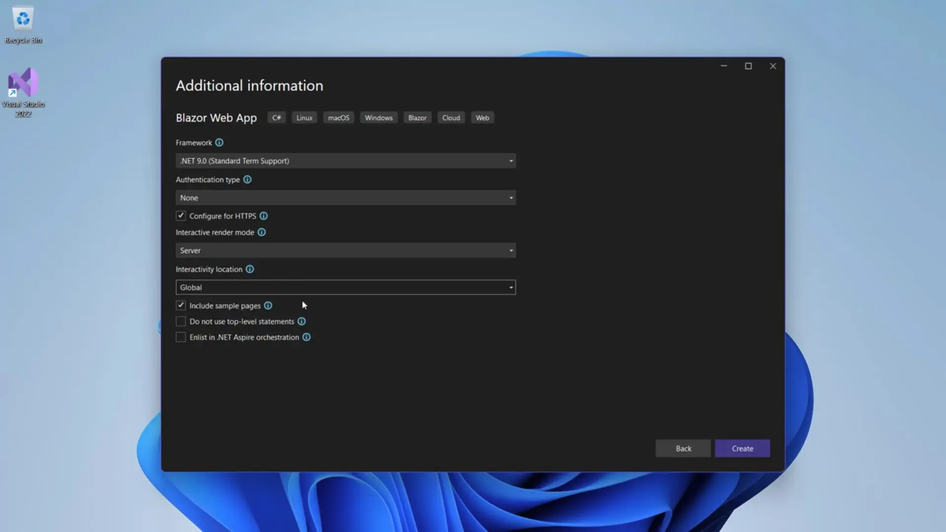
Click Create.
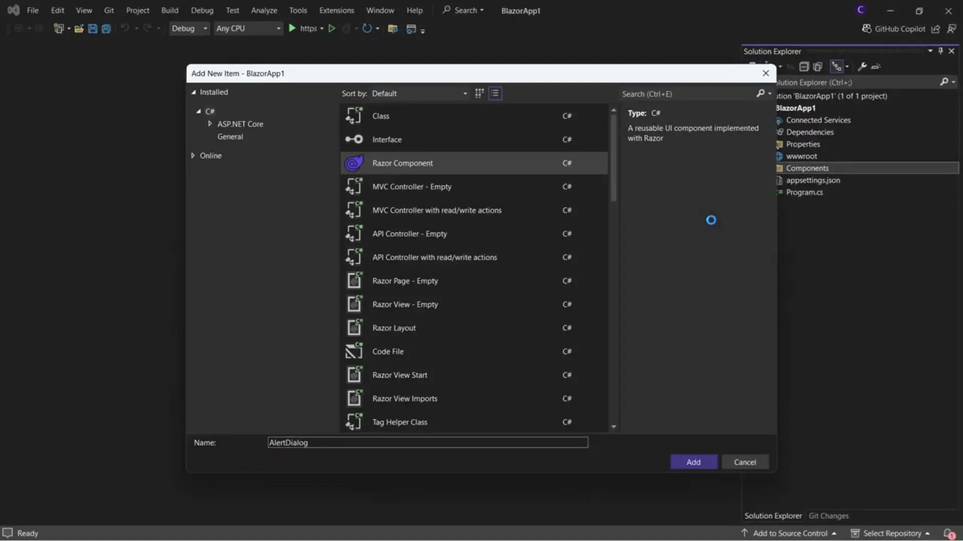
Step 2: Create the AlertDialog Component
In the Solution Explorer, you will see a Components folder.
- Right-click the
Componentsfolder. - Select Add > Razor Component.
- Name it
AlertDialog.razor.
The Razor Syntax
Razor components use the .razor extension. Inside, you can mix HTML and C#. The @ symbol allows you to transition from HTML to C#.
<h3>@headingText</h3>

@code {
     string headingText = "Hello World";
}
Define the markup
Now, let’s replace the above markup with the actual markup for our dialog:
   <div class="alert-dialog-overlay" id="alert-dialog-overlay">
        <div class="alert-dialog" id="alert-dialog">
            <div class="alert-dialog-header">
            <h3>Hey there!</h3>
            </div>
            <div class="alert-dialog-body">
            <p>A very important message</p>
            </div>
            <div class="alert-dialog-footer">
            <button id="btn-Close">Close</button>
            </div>
        </div>
    </div>
Step 3: Styling the Component (CSS Isolation)
To keep our styles organized, we will use Scoped CSS. This ensures styles defined for this component don’t leak into other parts of the application.
- Right-click the
Componentsfolder > Add New Item. - Name it
AlertDialog.razor.css(Visual Studio will nest this under the component). - Add your dialog-specific CSS styles:
.alert-dialog-overlay {
    display: flex;
    justify-content: center;
    align-items: center;
    position: fixed;
    top: 0;
    left: 0;
    right: 0;
    bottom: 0;
    background-color: rgba(0, 0, 0, 0.5);
    z-index: 9999;
}

.alert-dialog {
    display: flex;
    flex-direction: column;
    align-items: center;
    background-color: white;
    padding: 20px;
    border-radius: 8px;
    width: 300px;
    max-width: 100%;
    box-shadow: 0 4px 8px rgba(0. 0, 0, 0.2);
}
Step 4: Making the Component Interactive
We want to show or hide the dialog based on user action. We can introduce a standard C# boolean field to track visibility.
@if (isVisible)
{
    <div class="alert-dialog-overlay" id="alert-dialog-overlay">
        <div class="alert-dialog" id="alert-dialog">
            <div class="alert-dialog-header">
            <h3>Hey there!</h3>
            </div>
            <div class="alert-dialog-body">
            <p>A very important message</p>
            </div>
            <div class="alert-dialog-footer">
            <button id="btn-Close">Close</button>
            </div>
        </div>
    </div>
}

@code {
     bool isVisible = true;
}
However, a component usually needs to be controlled by its parent (e.g., the Home page). To allow the parent to control the child component, we use Parameters.
Using [Parameter]
Update AlertDialog.razor to accept an IsVisible value from the parent, instead of our isVisible field, and make sure to change @if (isVisible) to @if (IsVisible) (notice the uppercase I) in the markup for the dialog:
@code {
    [Parameter]
    public bool IsVisible { get; set; }
}
Now, in Home.razor, you can consume the AlertDialog component by introducing an <AlertDialog /> tag, passing in a value for the parameter:
<AlertDialog IsVisible="true" />Step 5: Handling Events (Parent-Child Communication)
We need a way to open the dialog from the Home page and close it from inside the Dialog component.
1. The Parent (Home.razor)
We add a button to the Home page to trigger the dialog.
<button @onclick="ShowDialog">Show Dialog</button>

<AlertDialog IsVisible="showDialog" OnClose="CloseDialog" />

@code {
     bool showDialog;

    private void ShowDialog()
    {
        showDialog = true;
    }

    private void CloseDialog()
    {
        showDialog = false;
    }
}
2. The Child (AlertDialog.razor)
The child needs to notify the parent when the “Close” button is clicked. We use EventCallback.
@if (IsVisible)
{
    <div class="alert-dialog-overlay" id="alert-dialog-overlay">
        <div class="alert-dialog" id="alert-dialog">
            <div class="alert-dialog-header">
            <h3>Hey there!</h3>
            </div>
            <div class="alert-dialog-body">
            <p>A very important message</p>
            </div>
            <div class="alert-dialog-footer">
            <button id="btn-Close"
                    @onclick="OnClose">Close</button>
            </div>
        </div>
    </div>
}

@code {
    [Parameter]
    public bool IsVisible { get; set; }

    [Parameter]
    public EventCallback OnClose { get;set;  }
}
When the user clicks “Close” inside the dialog, it triggers the OnClose callback, which runs the CloseDialog method in the parent, setting showDialog to false.
Step 6: Customizing Content (Templated Components)
What if we want to change the text inside the dialog without hardcoding it? We could add Title and Message string parameters, but for full flexibility (like adding bold text or images), we use RenderFragment.
Update AlertDialog.razor:
@if (IsVisible)
{
    <div class="alert-dialog-overlay" id="alert-dialog-overlay">
        <div class="alert-dialog" id="alert-dialog">
            @ChildContent
            <div class="alert-dialog-footer">
            <button id="btn-Close"
                    @onclick="OnClose">Close</button>
            </div>
        </div>
    </div>
}

@code {
    [Parameter]
    public bool IsVisible { get; set; }

    [Parameter]
    public EventCallback OnClose { get; set; }

    [Parameter]
    public RenderFragment ChildContent { get; set; }
}
Now, in Home.razor, we can pass any HTML we want inside the component tags:
<AlertDialog IsVisible="showDialog" OnClose="CloseDialog">
    <div>
        <h2>Alert!</h2>
    </div>
     <div>
        Important Message
     </div>
</AlertDialog>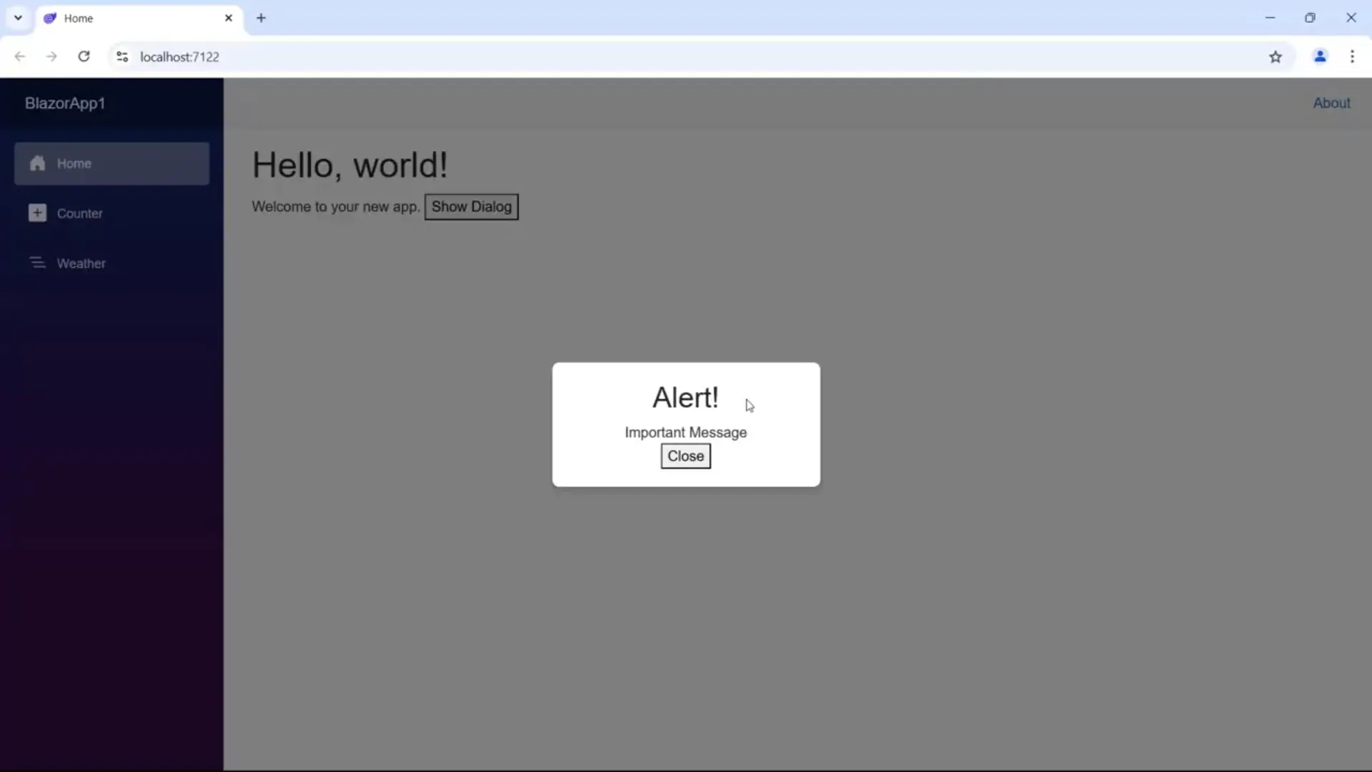
Conclusion
In this tutorial, we covered the basics of Blazor Components:
- Structure: Mixing HTML, CSS, and C#.
- Parameters: Passing data from Parent to Child.
- EventCallback: Passing events from Child to Parent.
- RenderFragment: Creating flexible, templated components.
By understanding these fundamentals, you can start building modular, maintainable, and interactive web applications using the full power of .NET.